
Beautybug: A one-stop review platform for better informed beauty purchases
Shopping from an ocean of beauty products is often a trial and error process. To avoid disappointment, one can potentially spend a fare bit of time searching for accurate and relevant reviews. Hence, I embarked on a personal project to design a review platform that would make it less of hassle for people to search for the very opinions they need, as well as a place to share, explore and discuss anything beauty.
Objective:
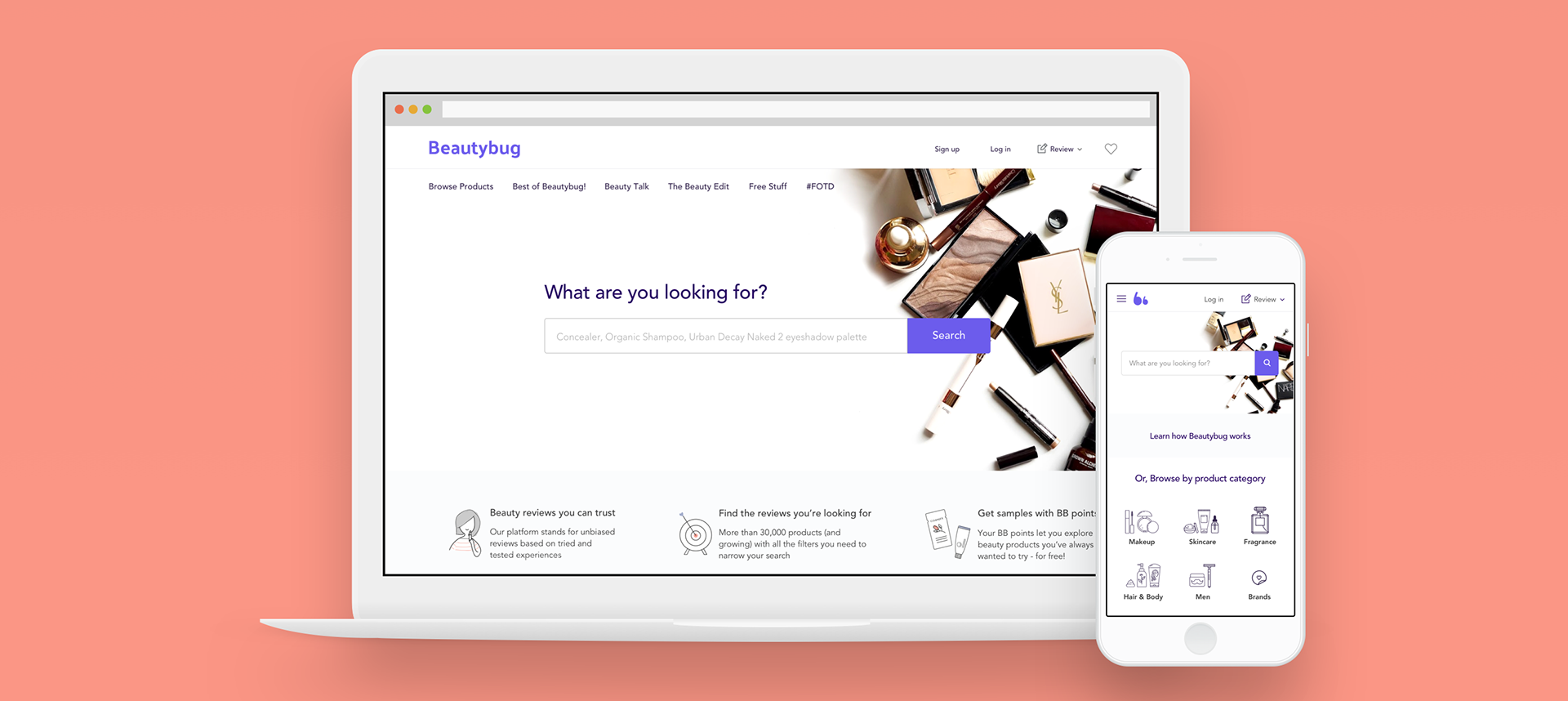
To create a responsive platform (with a web focus) that makes it easier for people to find relevant, helpful reviews or suggestions for wiser purchase decisions. The platform should offer users with a variety of search options, while still being easy to navigate through the content.
Project Duration:
4 weeks of 20hours/ week
Phase 1: Discover
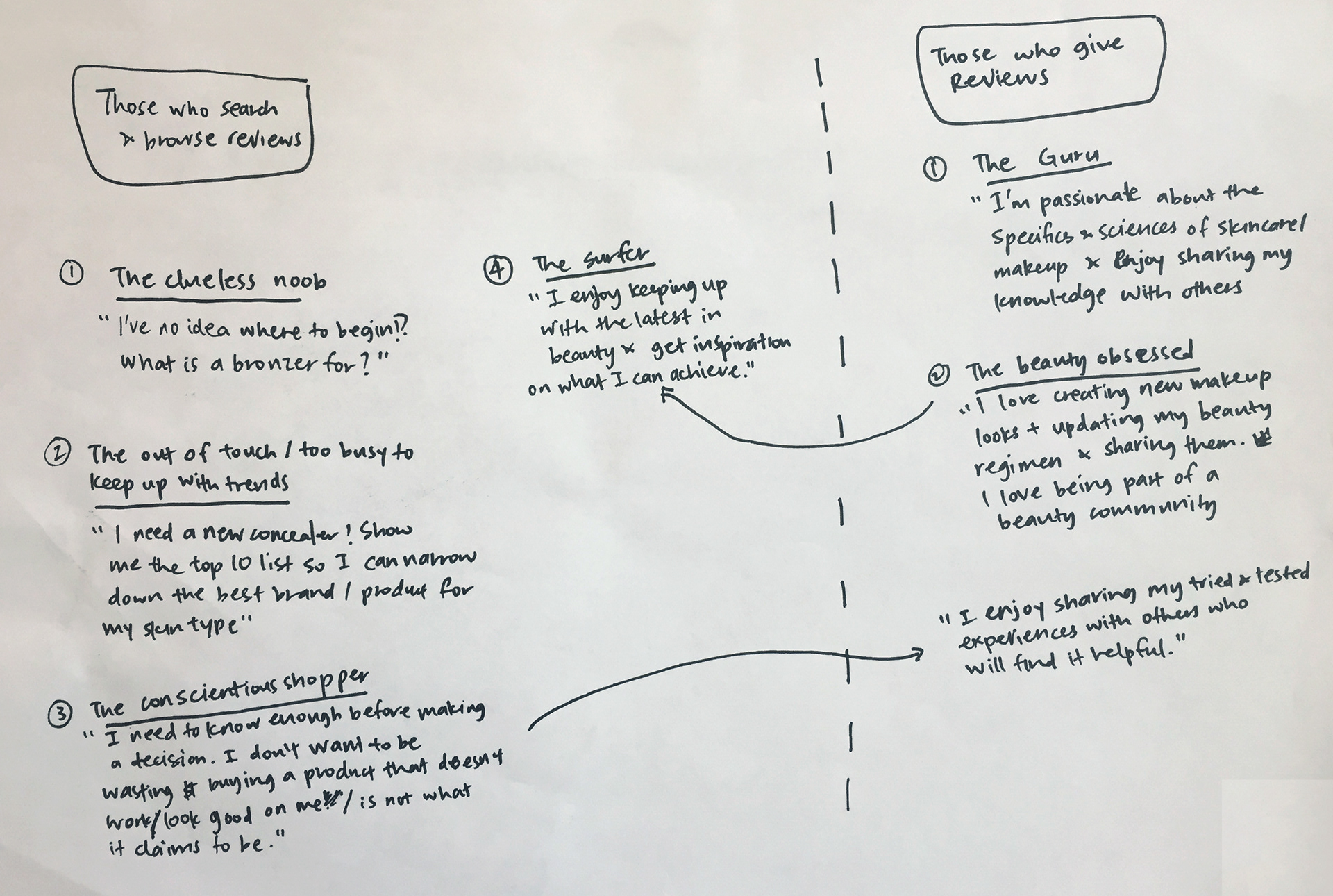
I started by brainstorming potential users of the platform and roughly scribbled 2 main groups of users: those who search and browse reviews; and those who review products.
Existing Beauty Review Platforms
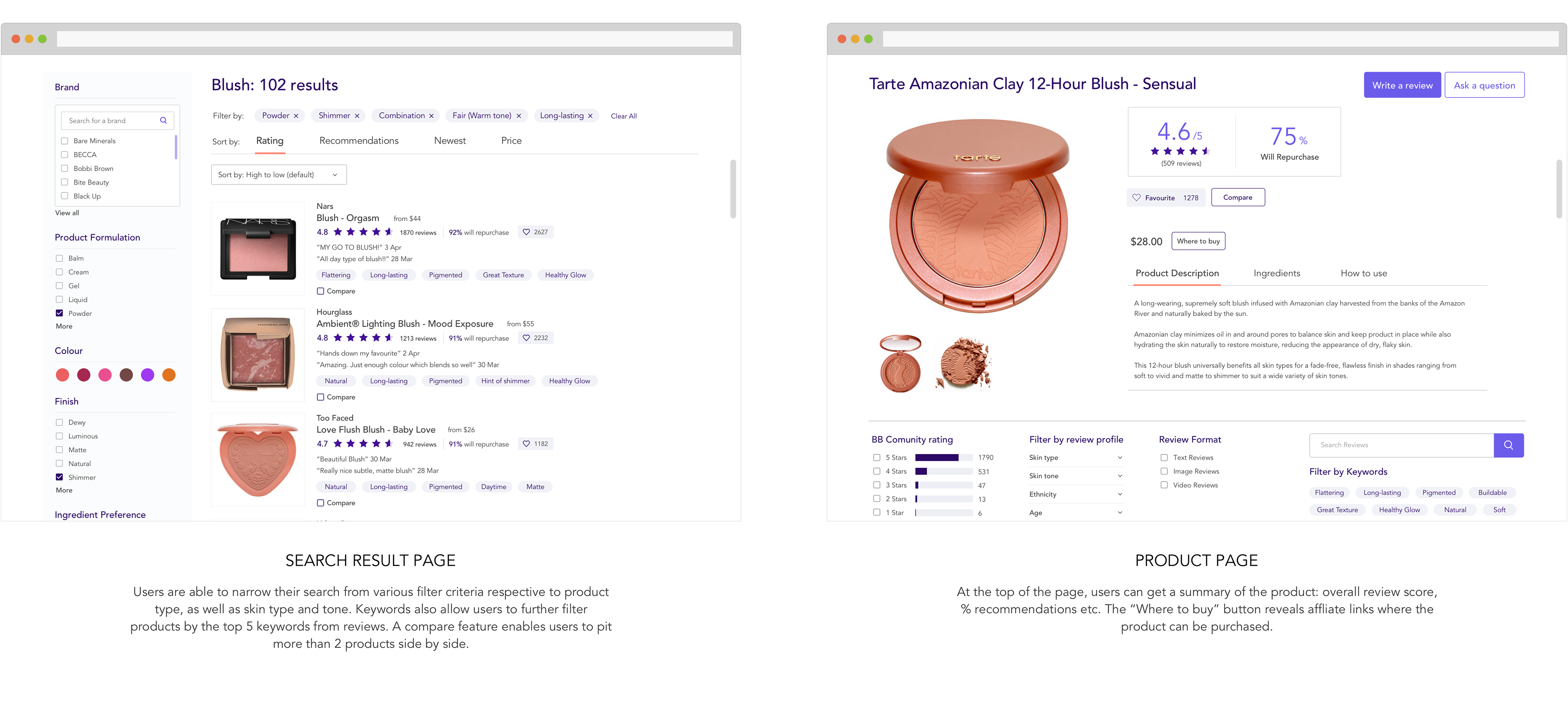
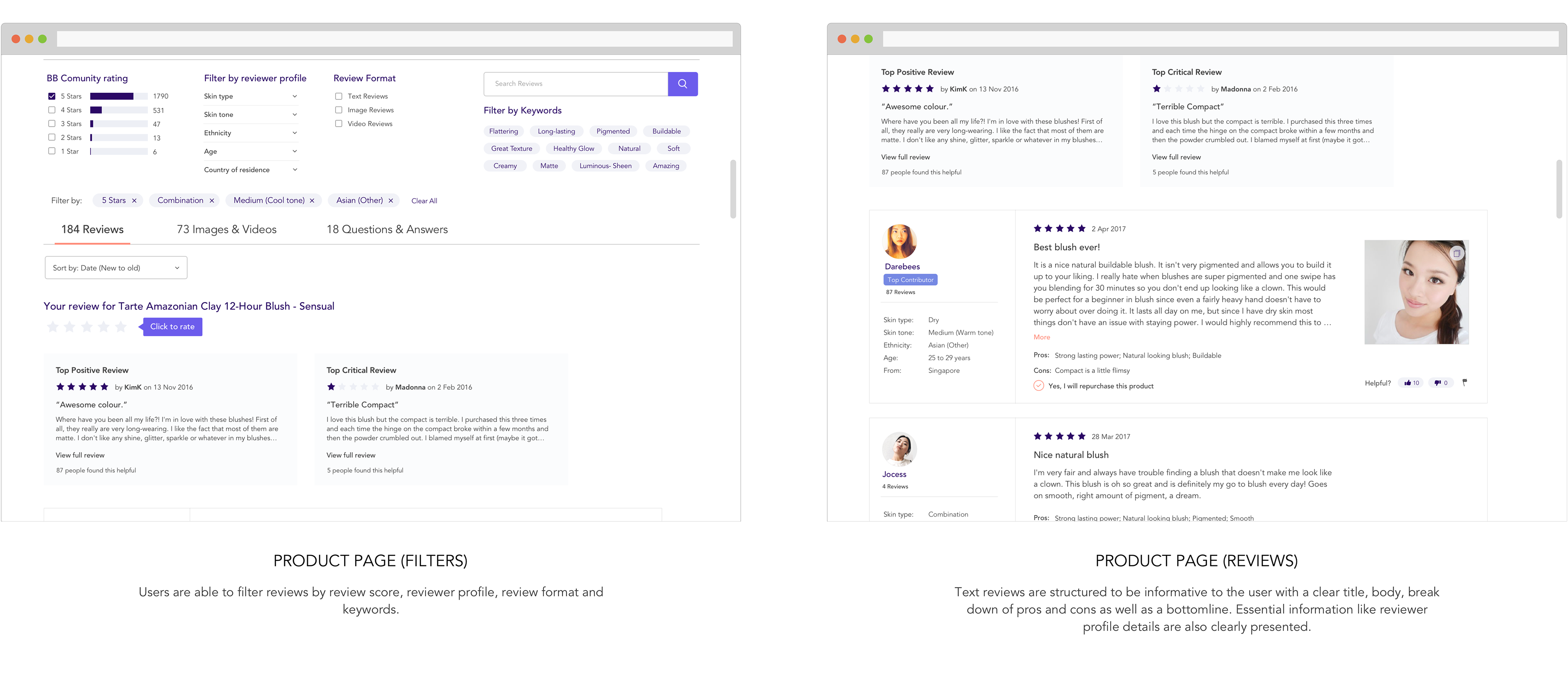
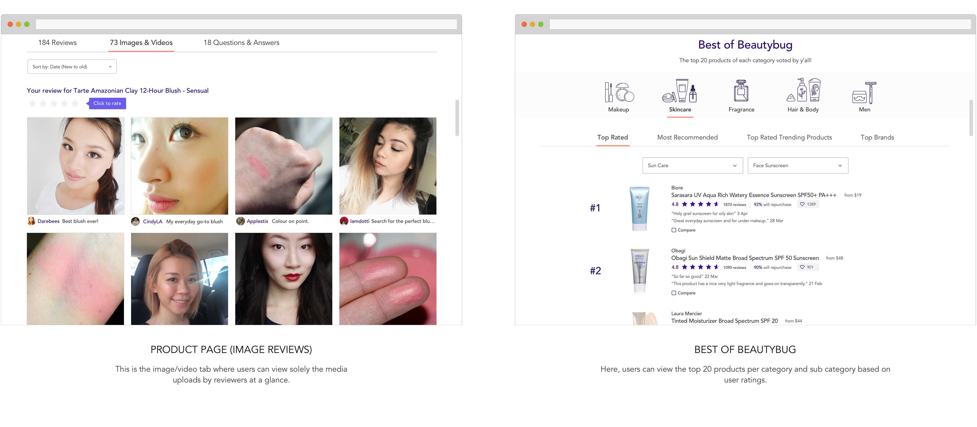
Next, I shortlisted 5 existing beauty review platforms for comparison, together with other merchant websites (Sephora, Amazon, iHerb, Mecca) to uncover gaps and glean some best practices. Some of the best practices i identified include: having a ratings distribution; a highlight of the top Positive and Negative review; Well structured review (i.e. Headline, Pros & Cons and Bottomline); Product specific search keywords; Product ranking within a category. I also found that leading competitive beauty review platforms had room for updating, may not be entirely objective or had layouts that were not the most intuititive.

User Research
I wanted to understand more about a beauty shoppers’ purchase journey, their considerations and pain-points experienced during this process. I also wanted to find out which persona most people would identify with and suss out the importance of various features and elements. Hence, I sent out an online survey which managed to collect 56 responses over 2 days. 98% of respondents were female, mainly between the ages of 25 to 29.
The key insights of the survey (below) revealed that there exists an opportunity for a beauty review platform that exceeds current platforms’ user experience. This can be done partly through better structured reviews and the availability of filters with a range of criteria.
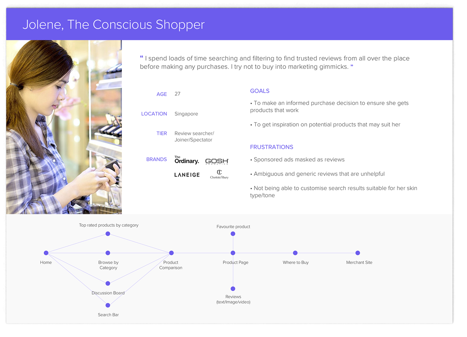
1. For those who search/browse reviews, most identified with the provisional persona of the conscious shopper. They want to make informed decisions, are particular about what goes on their skin and do not want to waste unnecessary resources
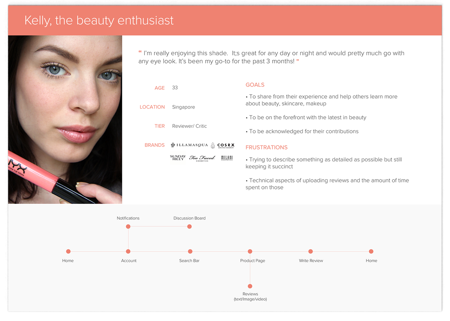
2. Only 5% of respondents have reviewed a product. They do it because they enjoy sharing their beauty regimen, tried & tested experiences and being part of the beauty community, hence identifying most with the beauty obsessed.
3. Top 3 frustrations on searching and reading beauty reviews:
- Skepticism on authenticity of reviews particularly for beauty influencers
- Difficulty in finding reviews that are applicable to one’s skin type/tone especially for Asian skin
- Quality and format of reviews result are mixed, ambiguous and don’t really help to inform.
Phase 2: Define
Persona
From the discover phase, I was able to validate my assumptions and established the two personas below, with the conscious shopper as the primary persona I was designing for the MVP. I also documented a top level userflow that each persona would take as they went through the site.
UX Strategy Blueprint and Product Roadmap
I compiled a UX strategy blueprint so I could have an overview of the problem I was trying to solve, as well as the focus areas and guiding principles of the site. A product roadmap helped me to prioritize the features that were needed for the MVP.
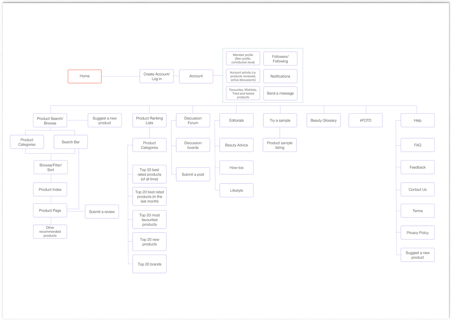
Site Map
Being a beauty review platform, Beautybug would be extremely heavy on information, as such a site map was crucial to lay out the overall structure of the website. I also brokedown the product categories into sub categories, as well as determined the filter and sort criterias that were to be present.
Phase 3: Design
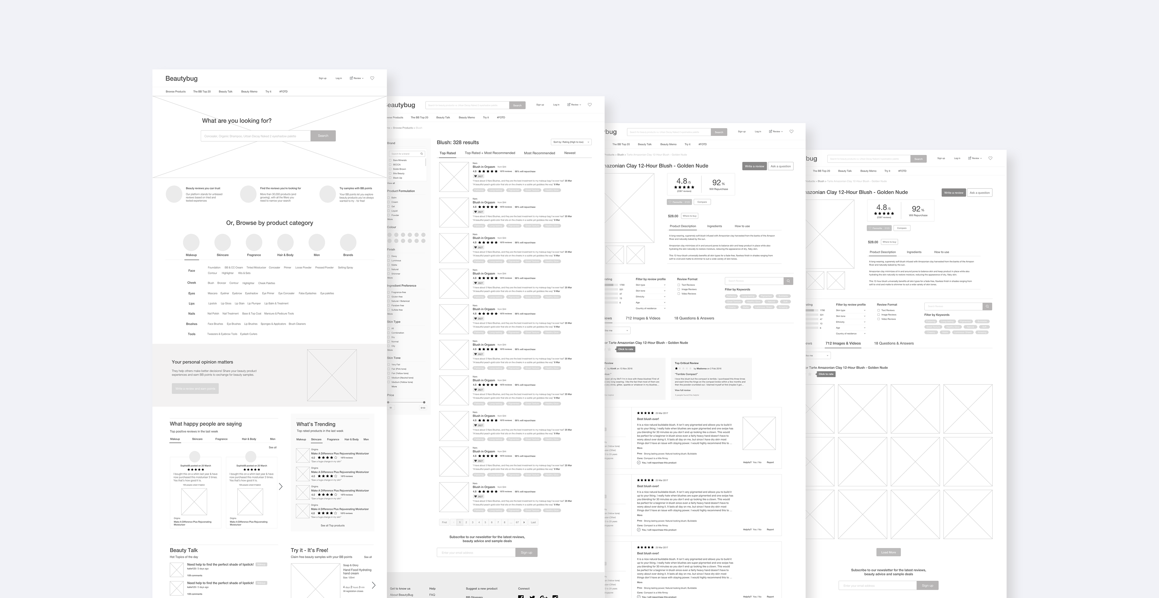
Once I identified the key pages that I would be designing for, I began sketching the pages of the website that I would later translate into wireframes.
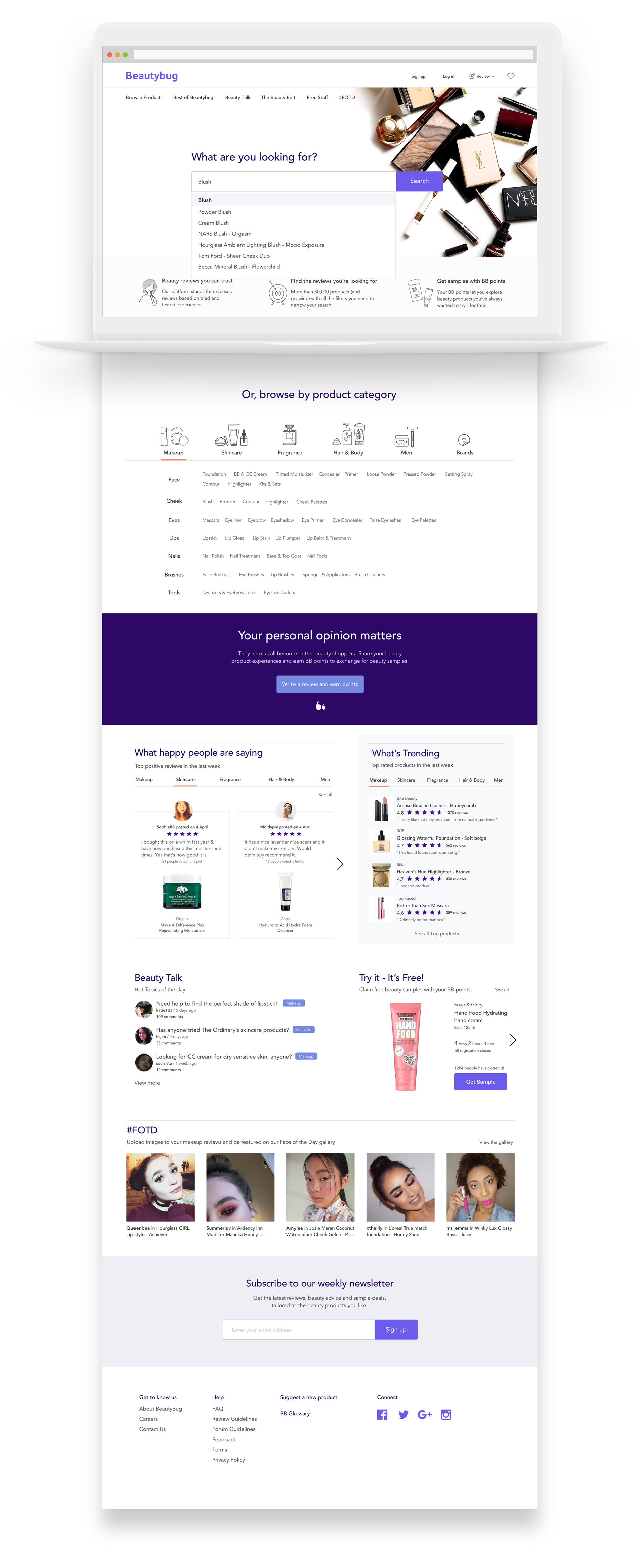
Then, I worked on a few explorations on how Beautybug could be expressed visually. Eventually deciding on a colour palette that hinted at beauty but stood out from the colours used by competitors. I also wanted the brand to be able to be recognized both by its wordmark or its symbol (inspired by a quotation mark) eventually. The style tile was applied to the UI.

Usability Testing
I used Invision to create a high fidelity prototype of the website and carried out a series of tasks with 4 respondents who fit the primary persona.
From the usability testing, participants could complete the tasks with ease and find the requested information. Overall, they did not feel overwhelmed by the amount of information. However, there were some areas of confusion seen mainly from the naming of the pages in the navigation menu, as well as the sort tabs on the search result page. The function of filtering by clicking on keywords was also unfamiliar to most participants.
Next steps
As this project was done within a short time frame, the focus was on the main pages, in particular - the review feature.
The plan moving forward would be to design the other pages of the platform such as account, discussion board, samples and editorial. In addition, the reward tier can be further explored in detail, together with the social aspect of the platform.
Eventually, the mobile app version should be designed as well.